Industry Dashboard
Energy USA
We are making tools and features affordably priced for everyone
The weathermodels.com Energy Industry Dashboard comes with awesome features like CDD/HDD tables for various models, intuitive graphical displays, and boxplots to enable streamlined handling of our vast data offerings. All of this comes with an affordable price tag.
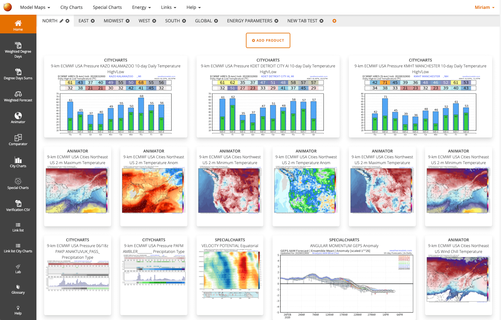
Customized dashboards
Organize customized dashboards with the maps and charts you need on a regular basis. You can arrange them by region, customer, or whatever else that helps streamline your workflow.
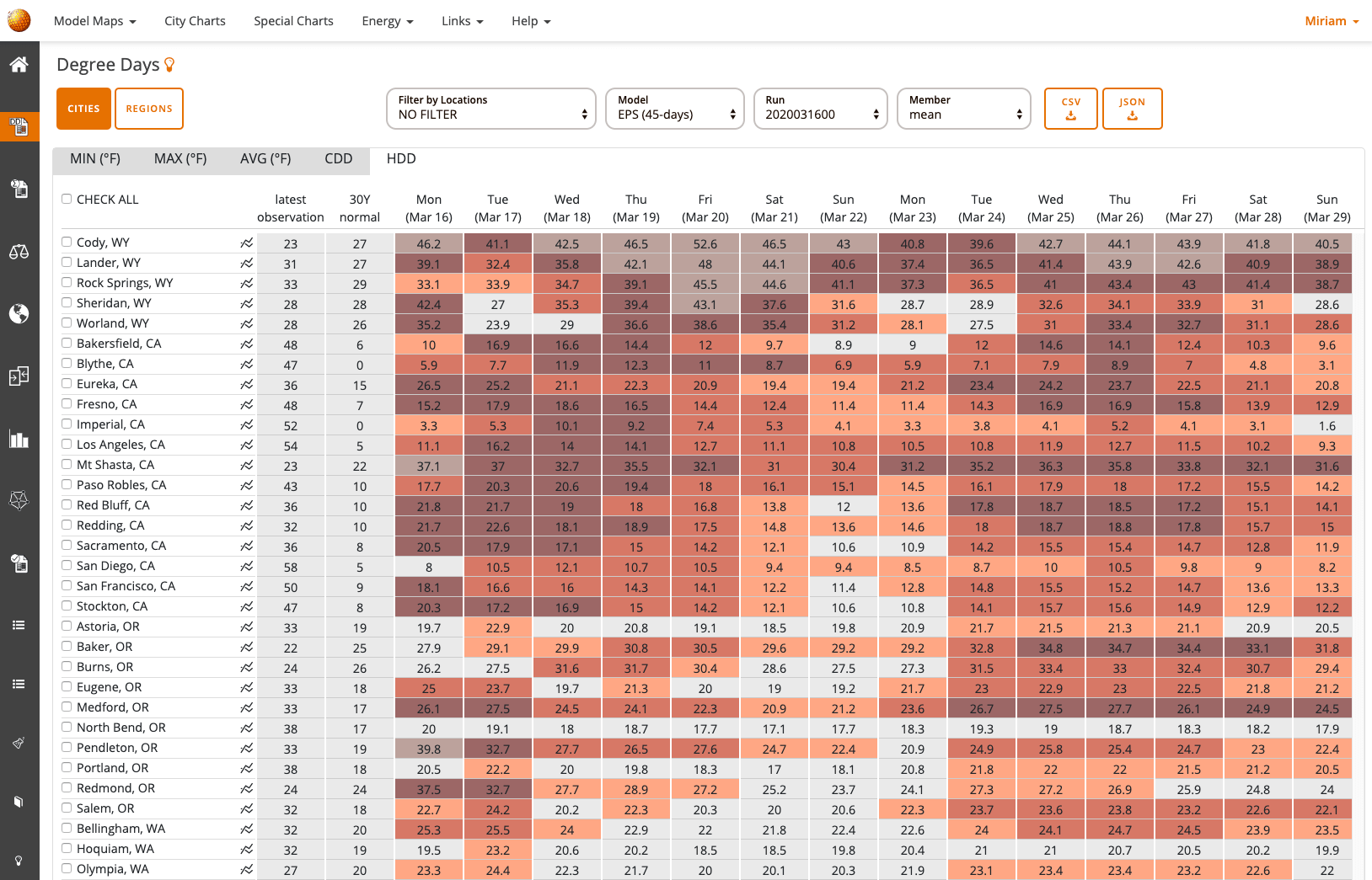
Degree Days
The weathermodels.com Industry Energy Account features degree day output for the 331 census cities displayed in an intuitive table that highlights anomalous values with color coding. Cooling degree days and heating degree days are available along with average temperatures and minimum/maximum temperatures. All data is comparable to climatological normal values.

Degree Days
Line graphs and box plots for Ensembles of CDD, Average, and Min/Max temperature are useful to understand the range of possible outcomes for a given forecast. We calculate the degree days for every ensemble member.
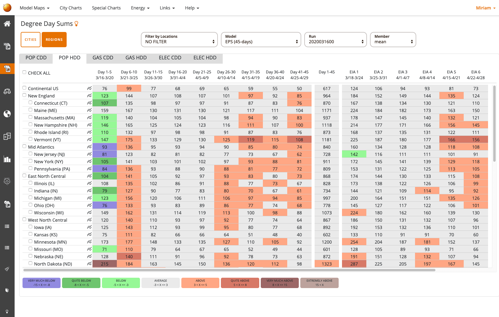
Degree Day Sums
Get degree day chunks for cities and census regions weighted by population, gas and electricity usage.
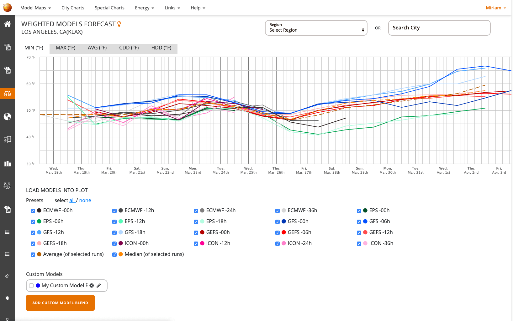
Weighted Models
To view all model forecasts for a certain location at once, we built our “Model Weighter” tool. It allows you to display several models and their last 4 runs for a given city and compare them.
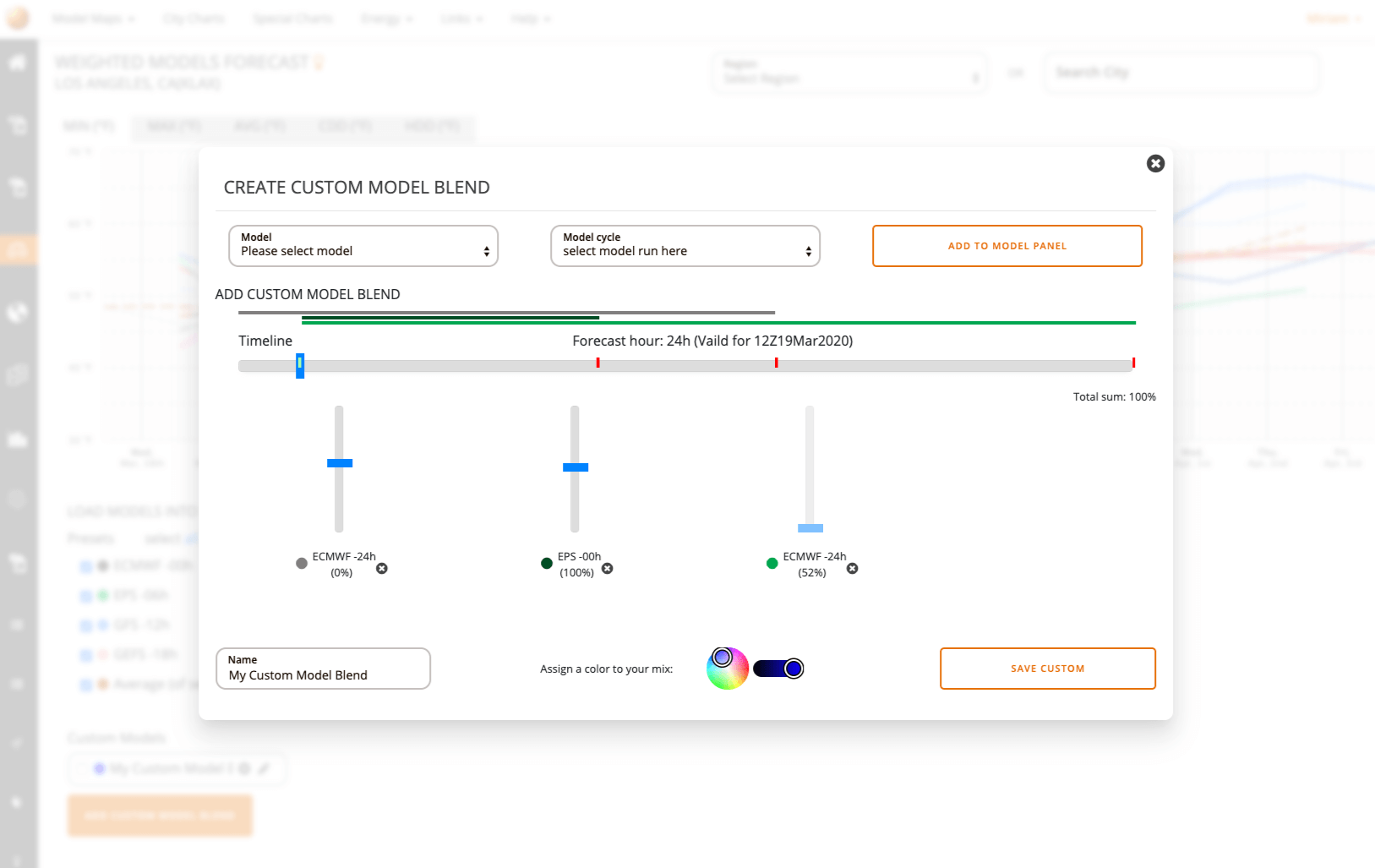
Create Custom Model Blends
Experienced forecasters also have the ability to build their own custom model blend and add it to the display. Think the EPS has a better handle on the short term pattern but the GEFS is more sensible farther out? A custom blend favoring EPS early and GEFS late will provide a forecast that reflects your analysis and expertise.
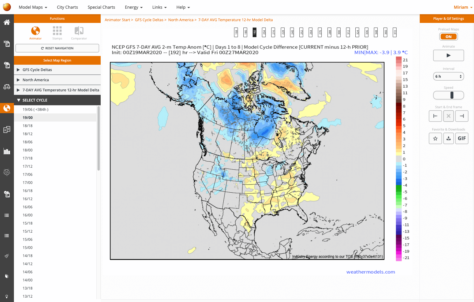
Model Animator
Our maps are prerendered, so they load fast and can be quickly animated with an intuitive forecast hour timeline.
Create custom GIFs or animate the maps with custom interval steps, speed and start & end frame.
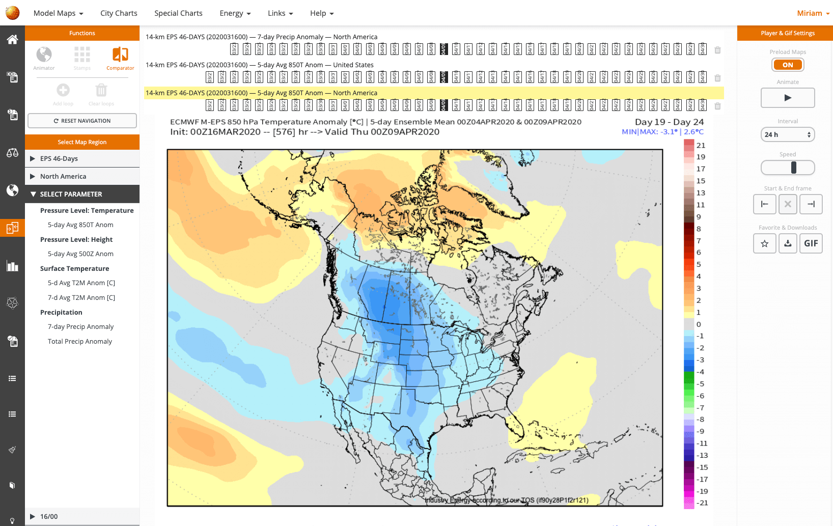
Model Comparator
Our comparator tool is for forecasters that need to find the nuances between model runs, contrast different atmospheric layers or compare forecast throughout model systems. A tool that is loved by both, our professionals and hobbyists as it allows for a quick decision.
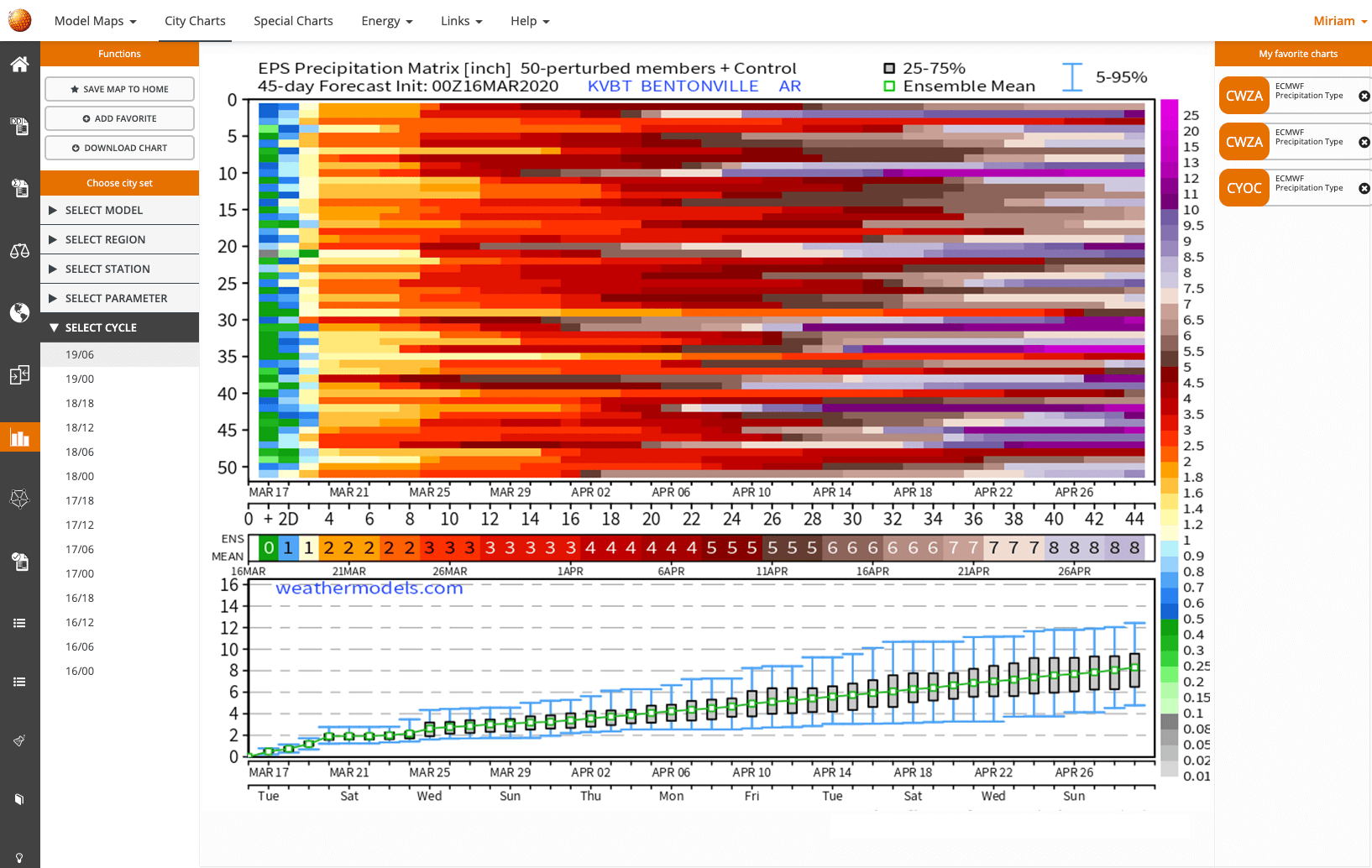
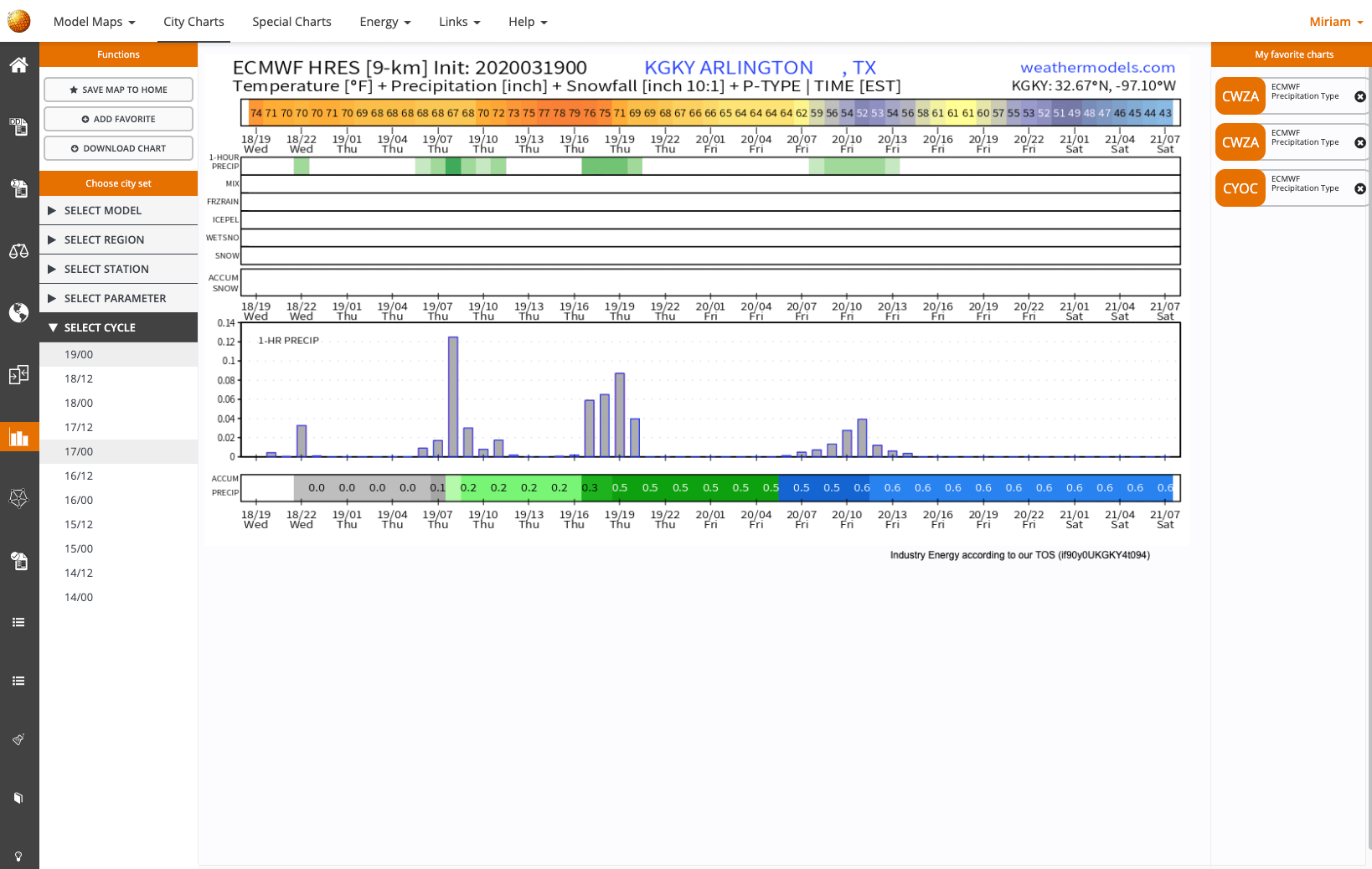
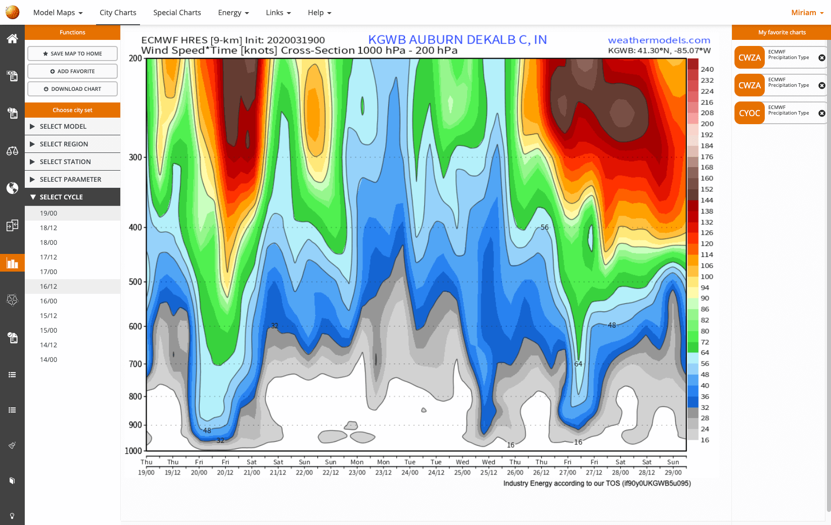
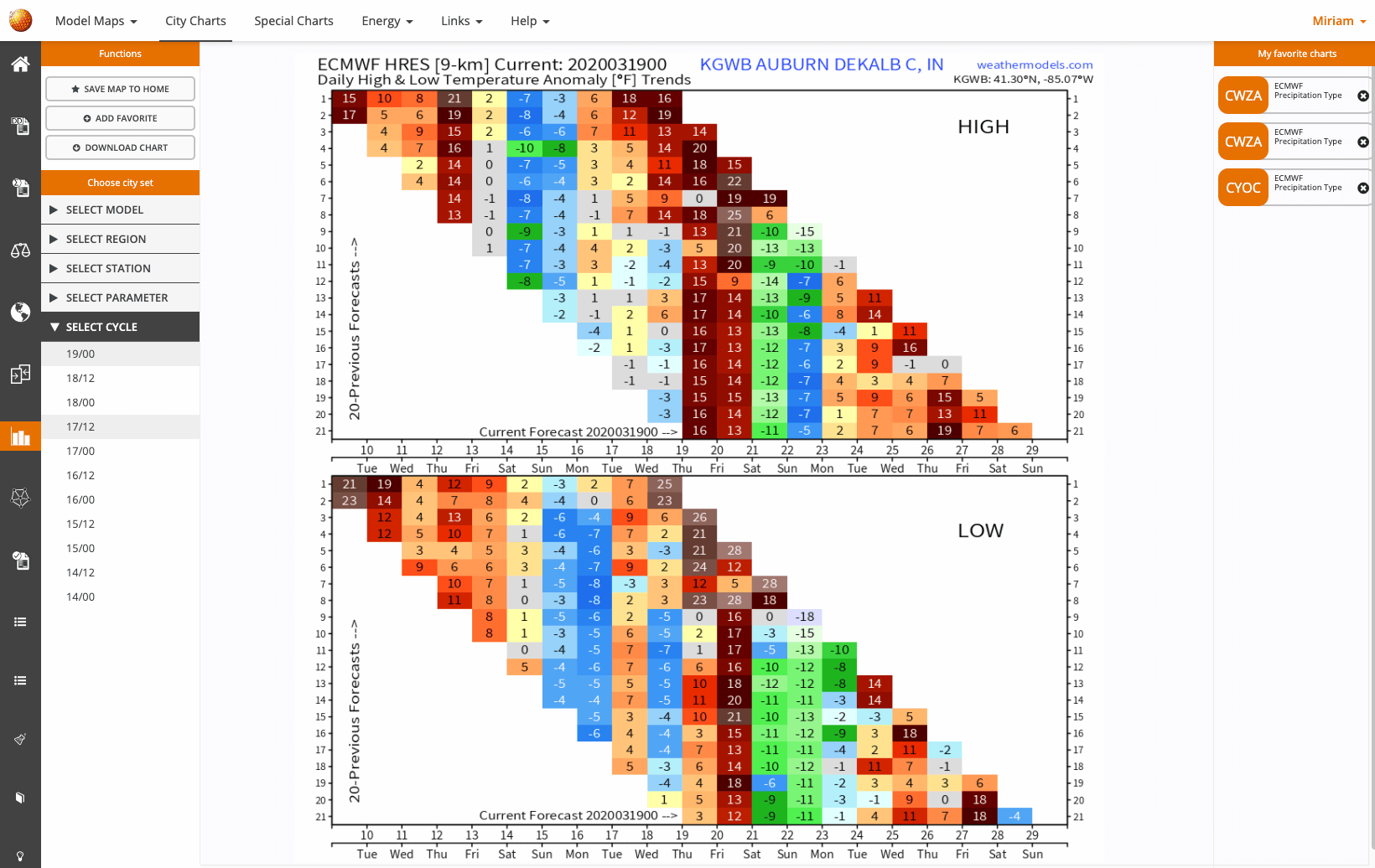
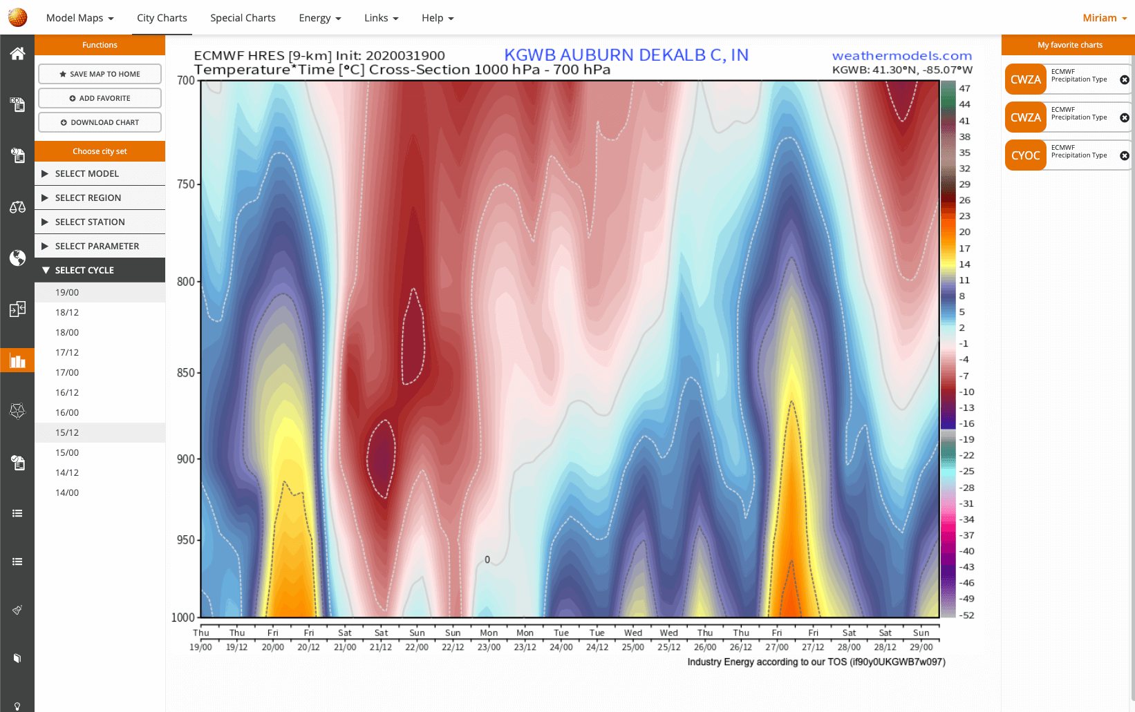
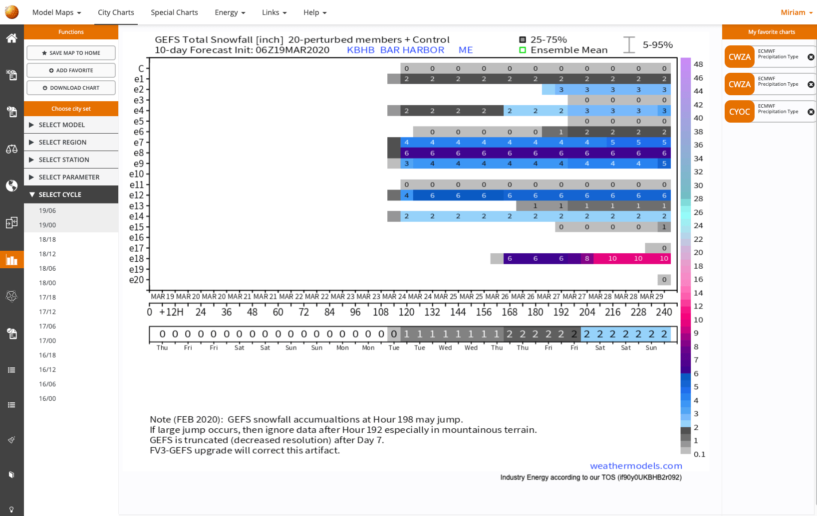
City Charts
Get all kinds of forecast charts for cities. From EPS ensembles precipitation matrices that depict all members at a glance to box plots charts and mixed parameter bar graphs.
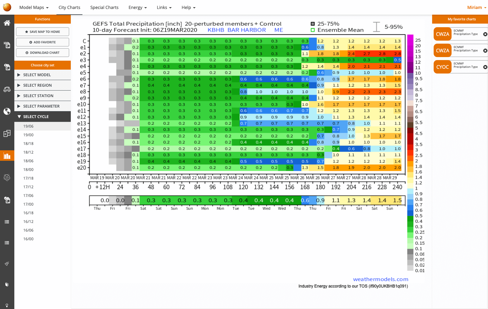
City Charts
Get all kinds of forecast charts for cities. From EPS ensembles precipitation matrices that depict all members at a glance to box plots charts and mixed parameter bar graphs.
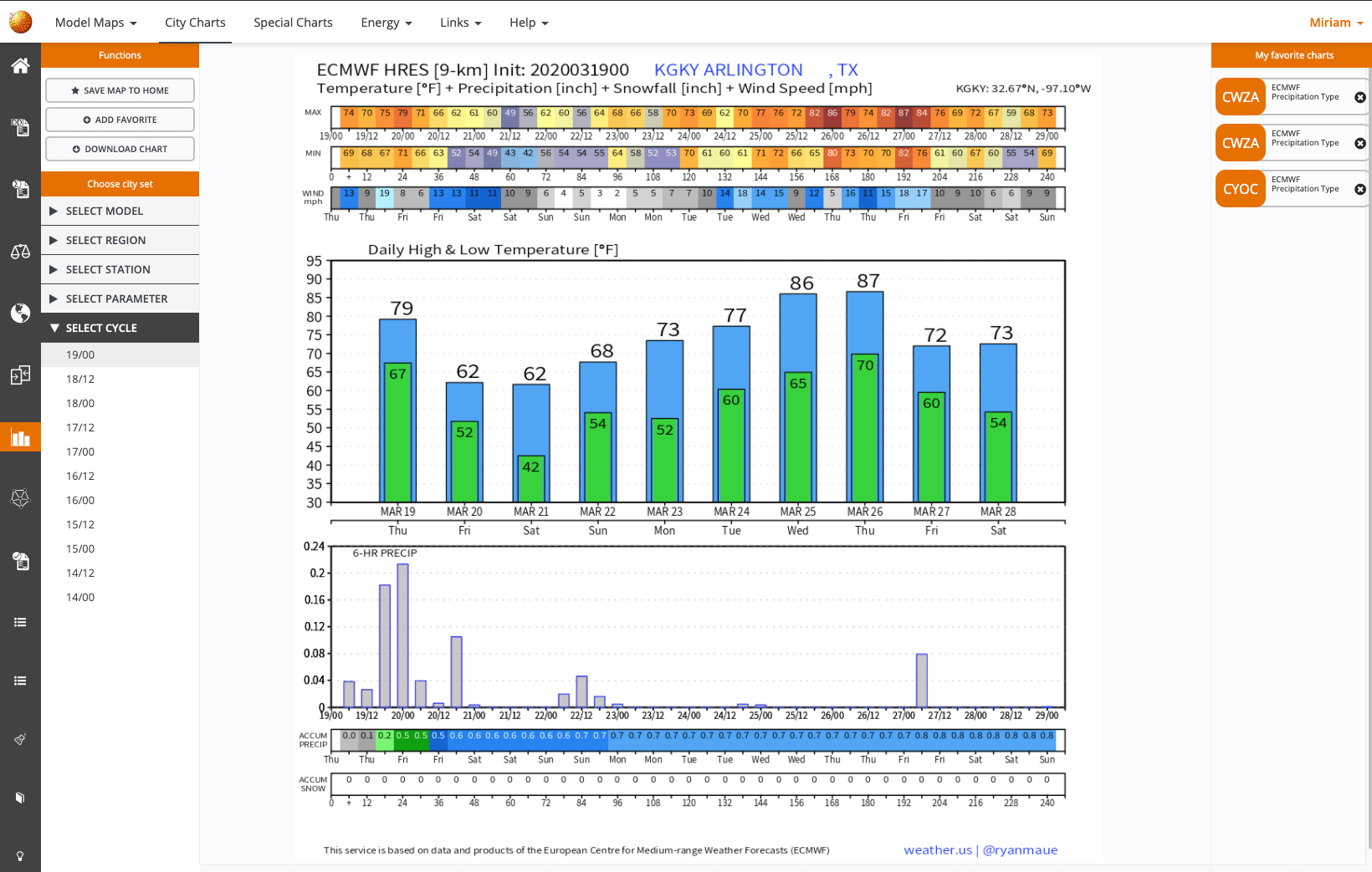
City Charts
Get all kinds of forecast charts for cities. From EPS ensembles precipitation matrices that depict all members at a glance to box plots charts and mixed parameter bar graphs.
City Charts
Get all kinds of forecast charts for cities. From EPS ensembles precipitation matrices that depict all members at a glance to box plots charts and mixed parameter bar graphs.
City Charts
Get all kinds of forecast charts for cities. From EPS ensembles precipitation matrices that depict all members at a glance to box plots charts and mixed parameter bar graphs.
City Charts
Get all kinds of forecast charts for cities. From EPS ensembles precipitation matrices that depict all members at a glance to box plots charts and mixed parameter bar graphs.
City Charts
Get all kinds of forecast charts for cities. From EPS ensembles precipitation matrices that depict all members at a glance to box plots charts and mixed parameter bar graphs.
City Charts
Get all kinds of forecast charts for cities. From EPS ensembles precipitation matrices that depict all members at a glance to box plots charts and mixed parameter bar graphs.
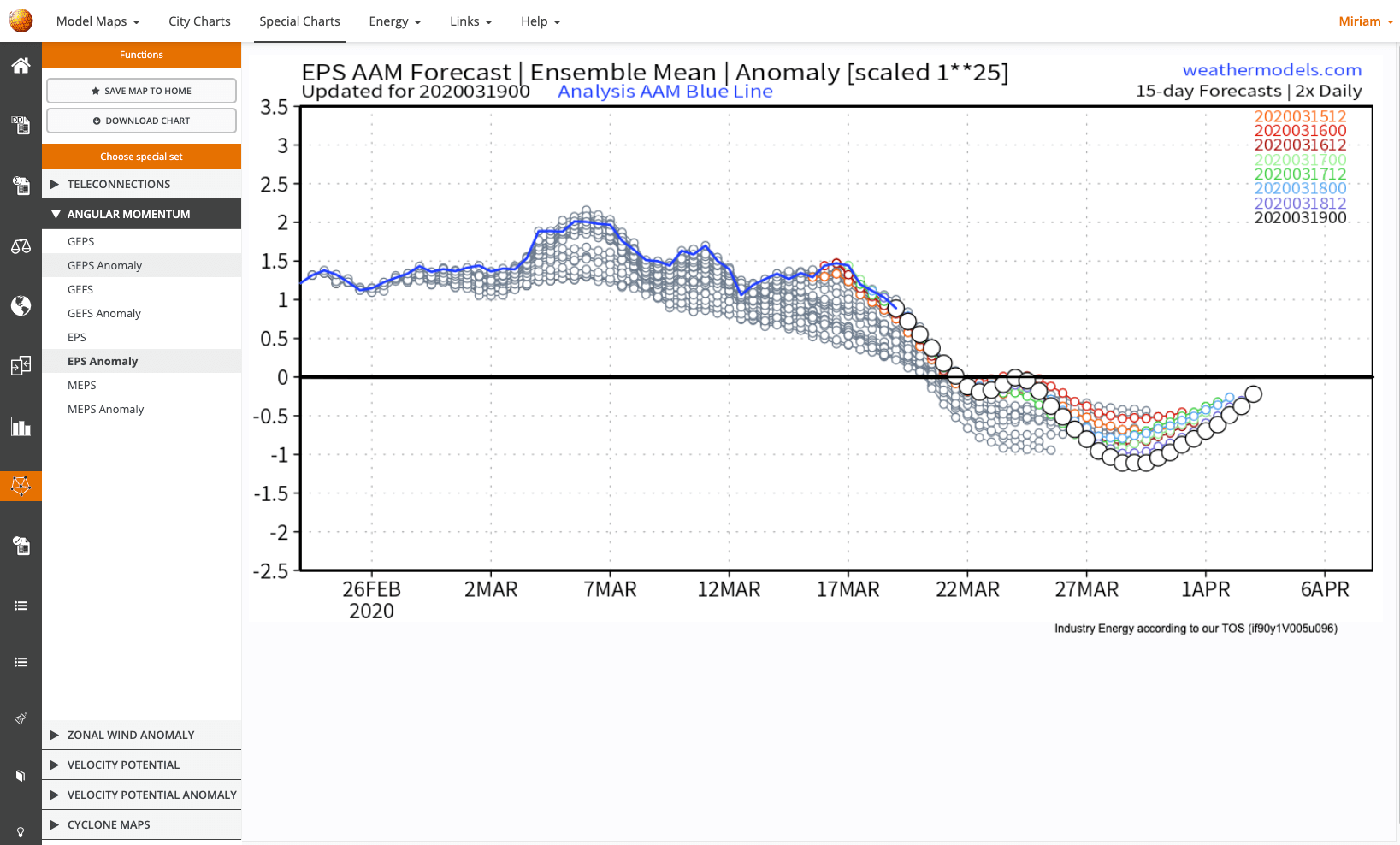
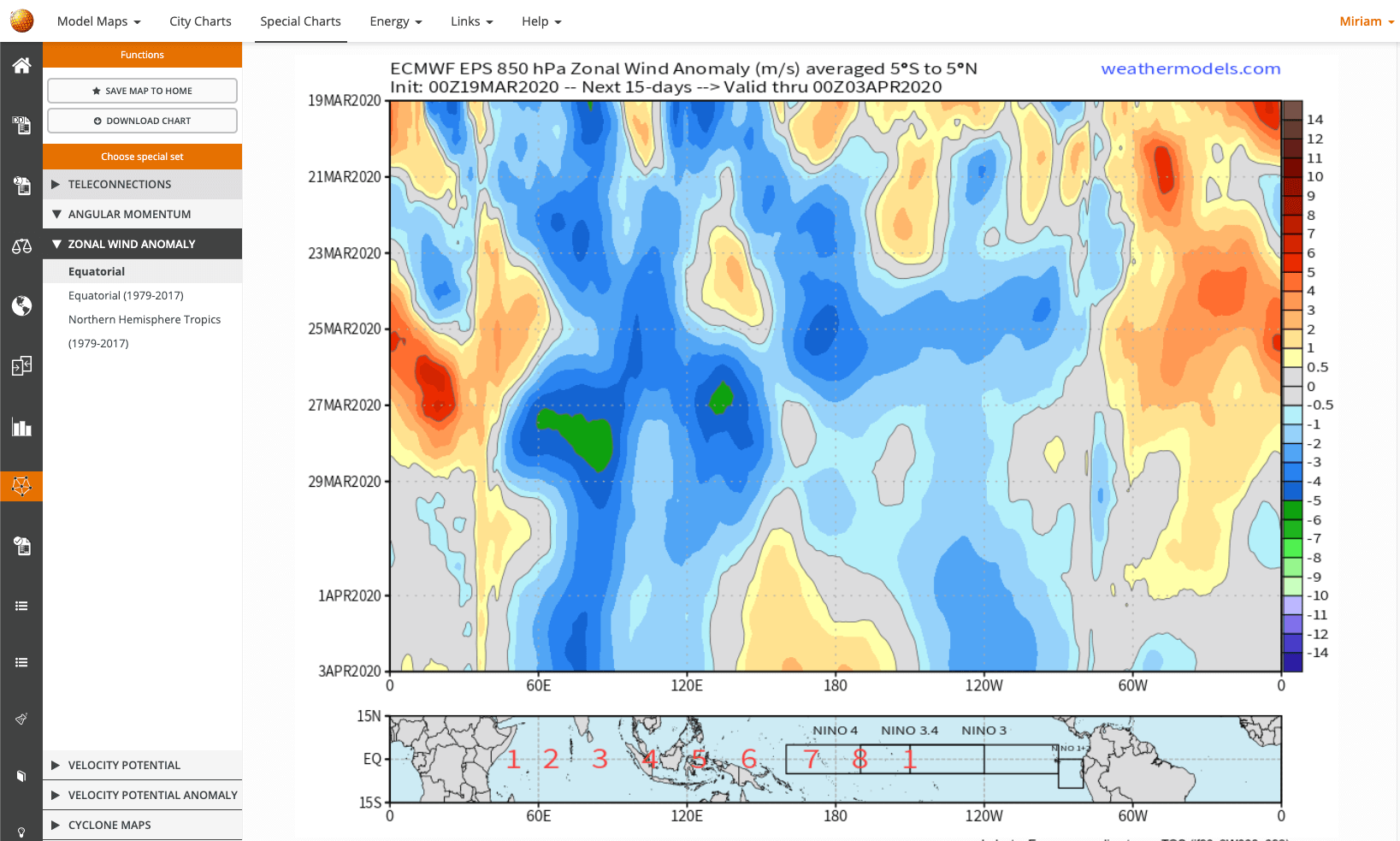
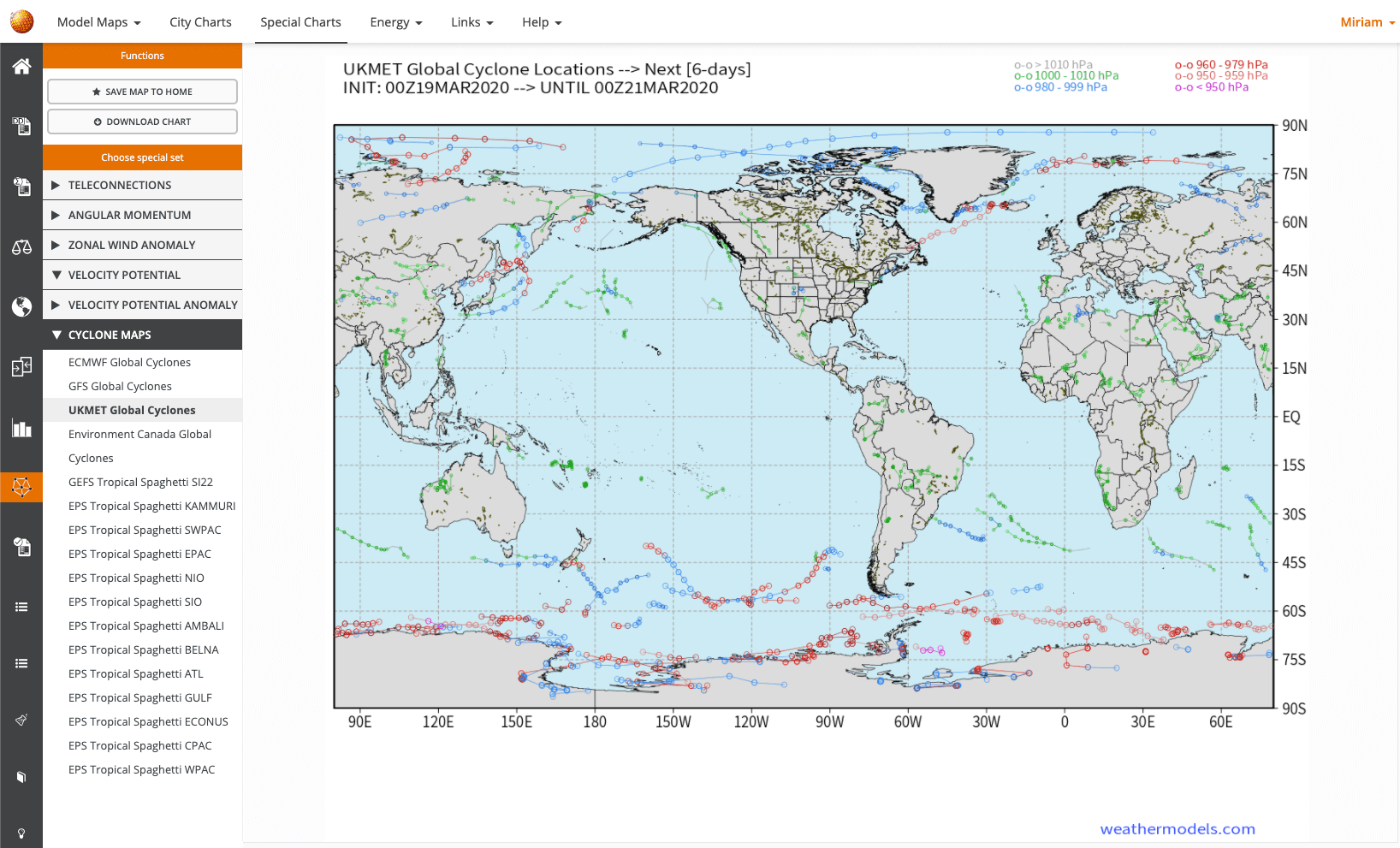
Special Charts
Our Special Charts are beautiful visualisations of weather data that aim to make complicated concepts easy to understand and grasp.
You'll get international ongoing Cyclone Maps, Teleconnections and for commercial and industry customers we also offer Angular Momentum charts, Velocity potential, and Velocity potential anomalies as well as Zonal Wind anomalies.
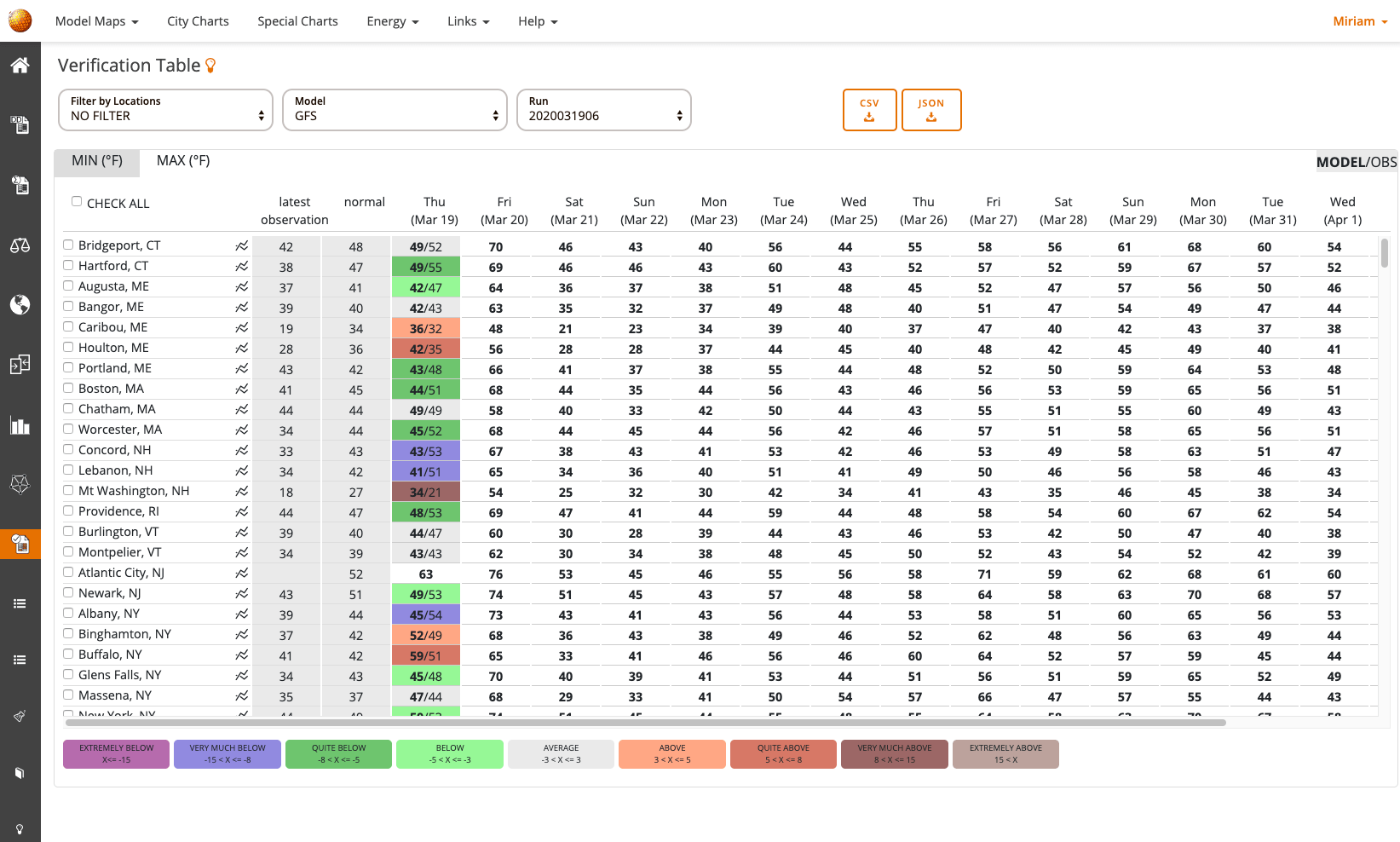
Verification Table
It is always important to know how well a certain model has performed, so we offer a verification table that compares recent model forecasts to actual observations and color codes the degree of deviation from the actual observation. This way, one can see very quickly how well a certain model run has performed and if any systemic biases are present.
- Organize your own dashboards to quickly access your favorite displays
- Design your own customized model blends to correct for model biases and produce output that reflects your forecaster experience
- Verify past model forecasts with actual observations
- Access a wide variety of extra special maps specific to long range energy forecasting such as zonal wind anomalies, angular momentum, and velocity potential anomalies
- Download CDD/HDD as csv or json files